
Cedar Woods

A layered precinct identity shaped by nature, wellbeing and life in flow

Verde 04 Verde 04
Verde Subiaco 03 Verde Subiaco 03
Client
Cedar Woods
Location
Perth, WA
Scope of work
Overview

Verde Subiaco is more than an apartment address. Set within a leafy pocket just 5km from Perth’s CBD, it introduces a composed residential precinct where architecture, landscape and lifestyle work together in harmony.

Martins Brand House developed a comprehensive brand approach for the precinct, creating a clear masterbrand alongside three individual apartment identities: Pètalo, Bloom and Fiōra. Each name draws from a botanical language, reinforcing Verde Subiaco’s landscape-led positioning while giving each building its own distinct character.

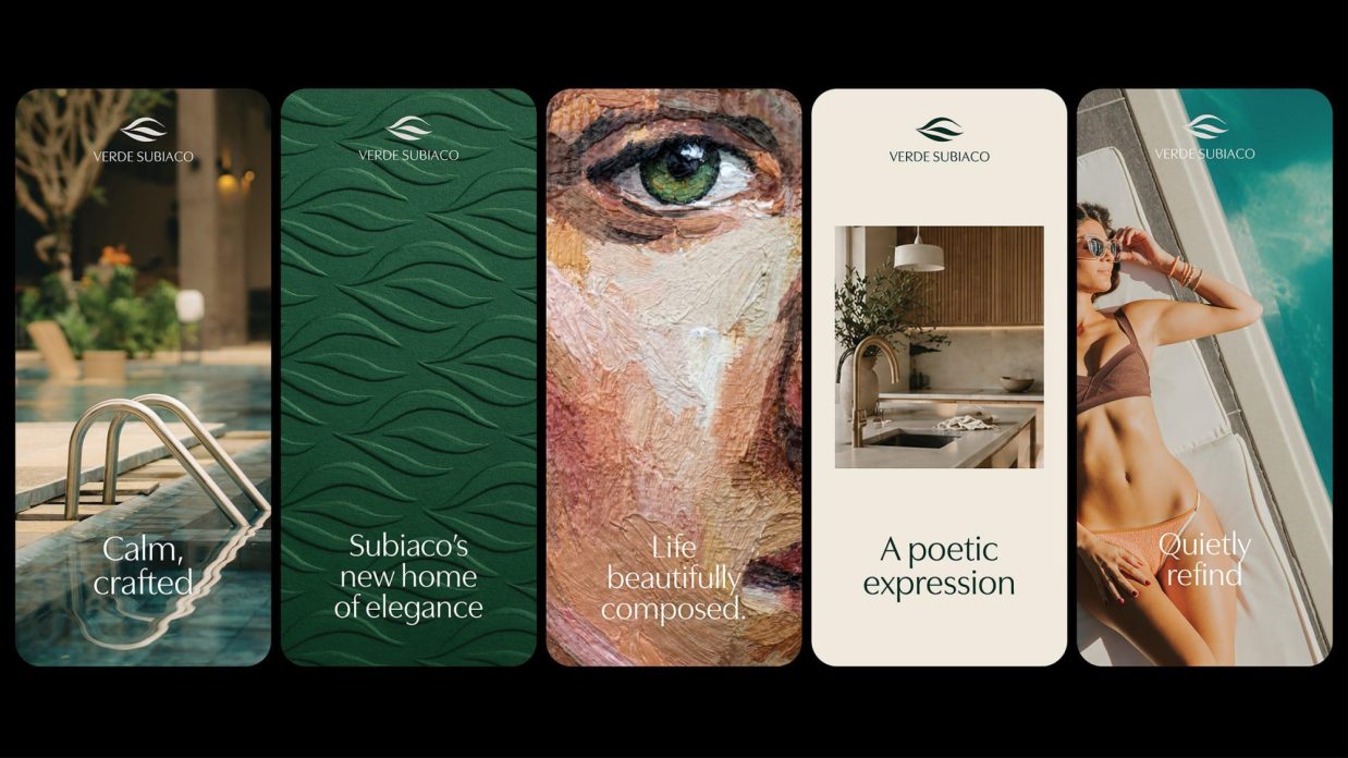
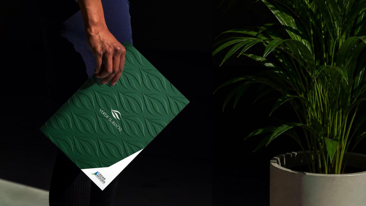
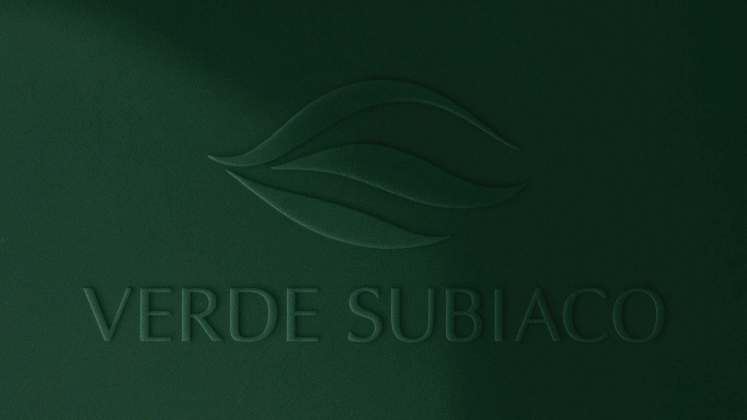
At the heart of the brand is the idea of life in flow. Inspired by the mature gum trees preserved across the site, the Verde Subiaco logo uses soft, layered leaf forms to express movement, calm and connection to place. The forms also reference the central pool and shared landscaped spaces that link the three buildings together.

A refined green palette, elegant typography and subtle tonal variations create a system that feels both unified and individual. Together, the masterbrand and apartment identities establish Verde Subiaco as a contemporary residential precinct defined by nature, wellbeing, connection and understated luxury.

A layered precinct identity shaped by nature, wellbeing and life in flow

Verde Subiaco / Cedar Woods

Verde Subiaco is more than an apartment address. Set within a leafy pocket just 5km from Perth’s CBD, it introduces a composed residential precinct where architecture, landscape and lifestyle work together in harmony.

Martins Brand House developed a comprehensive brand approach for the precinct, creating a clear masterbrand alongside three individual apartment identities: Pètalo, Bloom and Fiōra. Each name draws from a botanical language, reinforcing Verde Subiaco’s landscape-led positioning while giving each building its own distinct character.

At the heart of the brand is the idea of life in flow. Inspired by the mature gum trees preserved across the site, the Verde Subiaco logo uses soft, layered leaf forms to express movement, calm and connection to place. The forms also reference the central pool and shared landscaped spaces that link the three buildings together.

A refined green palette, elegant typography and subtle tonal variations create a system that feels both unified and individual. Together, the masterbrand and apartment identities establish Verde Subiaco as a contemporary residential precinct defined by nature, wellbeing, connection and understated luxury.

Verde 04 image

Verde Subiaco 03 image