


Mirvac

A life more beautiful

3 3
5 5
1 1
2 2
Client
Mirvac
Location
Georges River, NSW
Scope of work
Overview

Mirvac saw Riverlands as more than a residential project in Sydney. Set beside the natural beauty of the Georges River, it was envisioned as a sanctuary. A place designed to nurture the human spirit through serene surroundings, architecturally considered homes and a community centred on joy, connection and free-spirited living.

Martins Brand House translated this vision into a brand identity that would connect with buyers while capturing the tranquillity of the environment and the promise of a vibrant yet peaceful lifestyle.

The creative territory “flow meets formality” was developed as the foundation of the brand. Inspired by the duality of the location, the fluid movement of the river and the structure of planned urban living, it expressed a balance between nature, community and aspiration.

The centrepiece of the identity was a hero graphic: an abstract representation of the Georges River. Brought to life through animation, it captured the movement of water and invited buyers to immerse themselves in the calm beauty of Riverlands.

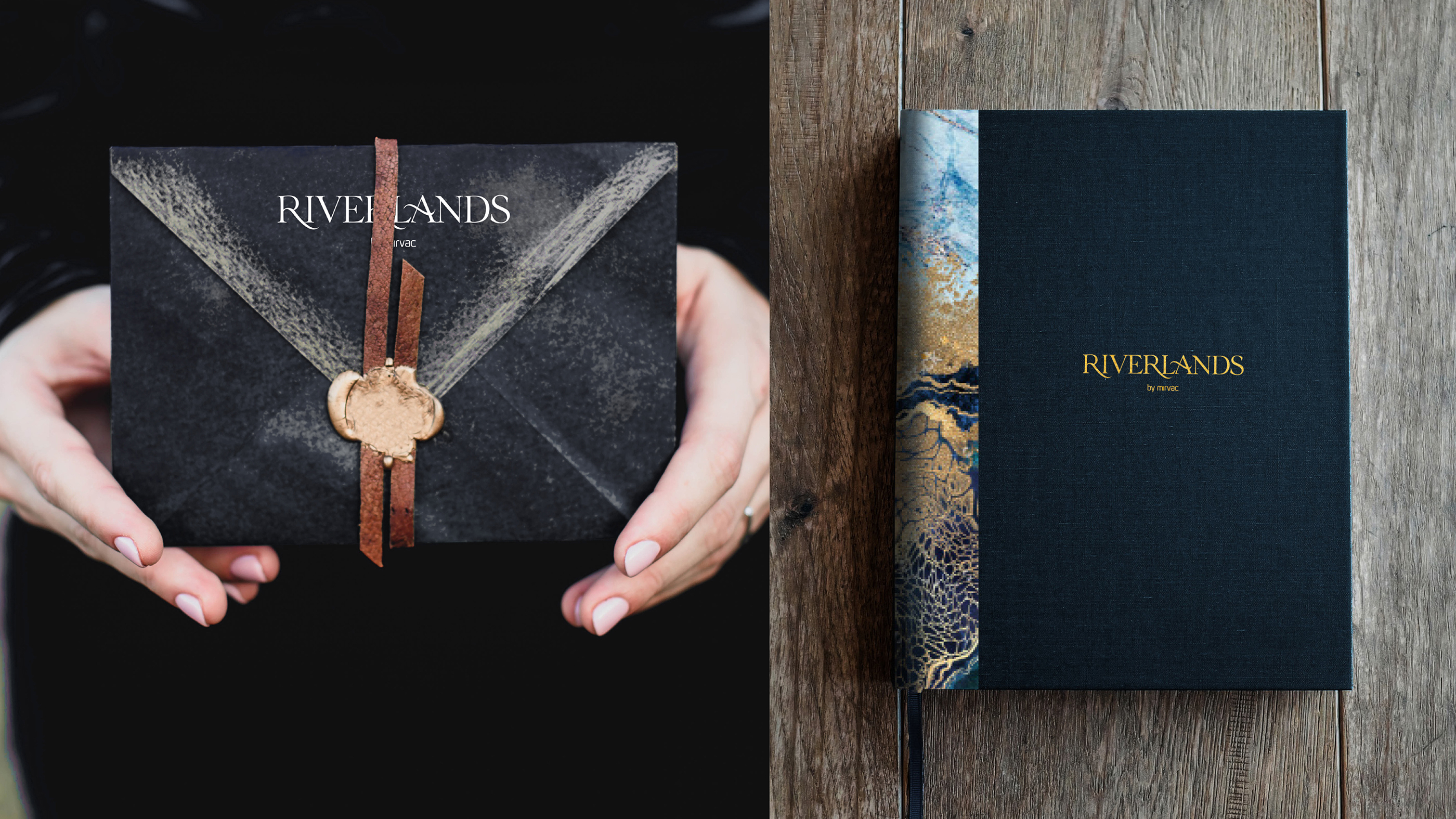
Considered typography, a cool colour palette and warm photography created a visual language that balanced organic natural cues with structured elegance. The result was a distinctive brand identity that positioned Riverlands as a desirable residential destination where natural beauty, modern convenience and community living come together.

A life more beautiful

Riverlands / Mirvac

Mirvac saw Riverlands as more than a residential project in Sydney. Set beside the natural beauty of the Georges River, it was envisioned as a sanctuary. A place designed to nurture the human spirit through serene surroundings, architecturally considered homes and a community centred on joy, connection and free-spirited living.

Martins Brand House translated this vision into a brand identity that would connect with buyers while capturing the tranquillity of the environment and the promise of a vibrant yet peaceful lifestyle.

The creative territory “flow meets formality” was developed as the foundation of the brand. Inspired by the duality of the location, the fluid movement of the river and the structure of planned urban living, it expressed a balance between nature, community and aspiration.

The centrepiece of the identity was a hero graphic: an abstract representation of the Georges River. Brought to life through animation, it captured the movement of water and invited buyers to immerse themselves in the calm beauty of Riverlands.

Considered typography, a cool colour palette and warm photography created a visual language that balanced organic natural cues with structured elegance. The result was a distinctive brand identity that positioned Riverlands as a desirable residential destination where natural beauty, modern convenience and community living come together.

3 image

5 image

1 image

2 image